
Top Designs for February
1. Grind
SL: Mum knows best

Chosen for:
Content. We are big fans of review emails, it’s nice to see when brands aren’t afraid to shout about how happy their customers are! This email from Grind is a great way to bring some humour into the email, whether it’s from an original source or not, we love how they’ve used it to their advantage.
2. Ben & Jerry's
SL: NEW Ben & Jerry Valentine’s Day Cards
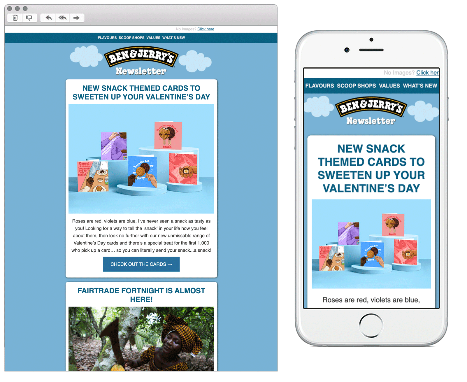
Chosen for:
Theme. A fun take on the Valentines occasion, highlighting the ice cream brands new limited edition range of cards.
Copy. Their humorous tone of voice has to be mentioned here! With their play on puns and words throughout, they’ve made the email light hearted and friendly.
3. Disney
SL: You've got mail
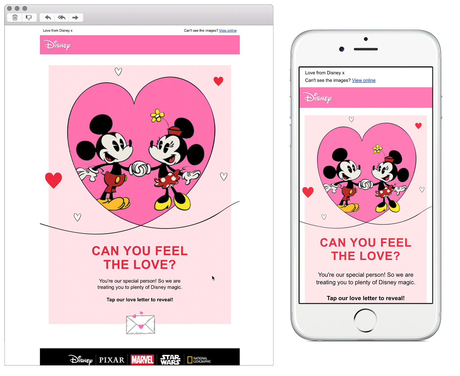
Chosen for:
Interactivity. Here is an excellent example of how to include interactivity in email. Keeping the content relevant and using tap to reveal content to add value to the users email experience. We love the theme here and the design made us want to continue scrolling (and stick on a Disney film!).
4. Dominos
SL: 👀 Tell us...How will you be spending Valentine’s Day? 😍

Chosen for:
Content. A fun interactive email from Domino’s! Each option is clickable and links through to a different landing page relating to the option the reader has chosen.
Design. Although the email has a clear nod to the Valentines occasion it’s nice that they’ve remained loyal to their usual branding. This helps to reinforce brand awareness to readers, making sure they know who it is from as soon as they open it.
5. Costa
SL: [Name] + Cupid's Cooler - love at first sip? ❤️

Chosen for:
Design. Beautiful eye catching animation upon open of this email, which drew our attention in straight away!
Personalisation. Pulling in the readers name to the subject line is a nice touch, but Costa have gone beyond this within the email itself. They have included their points system in the tertiary module, reminding the customer of how many drink stamps they currently have and how many to go until they’re entitled to a free drink. A great way to reinforce how each subscribers is recognised and appriciated.
6. Greggs
SL: Say it with Greggs

Chosen for:
Copy. If a pastry isn’t the way to your heart, a good pun will do the trick. Taking a more simplistic design approach here, but Greggs have stolen the show with their copy. They know exactly who their audience are and do a great job at talking to them in a friendly and relatable way.

Bex Highfield
Marketing strategist
