
Top Designs for September
With our British summer drawing to a close, we’re just about ready to dust off the Halloween decorations and put our pumpkins out. So with that in mind we’re kicking off this months email round-up with our first early (not that we’re complaining 👻) Halloween email.
Enjoy and let us know which ones may have inspired you, or if we may have missed any over on our Instagram or Twitter.
1. Olli Ella
SL: WIN free gifts, BIG discounts and more on our Halloween wheel 🎃
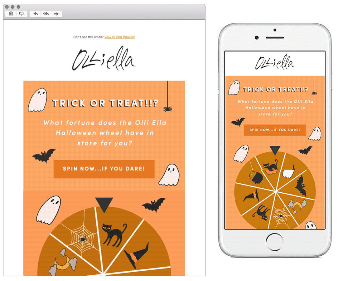
Chosen for:
Theme. Whilst we don’t support such an image heavy email, how can we not love with this cute design. The spinning wheel grabs the readers attention straight away, and the little illustrations fit in so well with the brand and their style.
2. GoPro
SL: Welcome HERO10

Chosen for:
Animation. This email from GoPro demonstrates that by using a design system emails are still able to stand out and be impactful. Using slick and eye-catching animation they’ve drawn attention to their product well, and using a pyramid structure draws the readers eye down to the call to action nicely.
3. Marleybones
SL: We'll let the reviews do the talking

Chosen for:
Content. Marleybones have done a great job at theming this email around something which adds value to potential customers - positive reviews! Reviews are often added in as a single or small module towards the bottom of an email, but when a brand receives such great reviews it should be something that is celebrated!
4. Patagonia
SL: Prints and patterns inspired by the Arctic seas
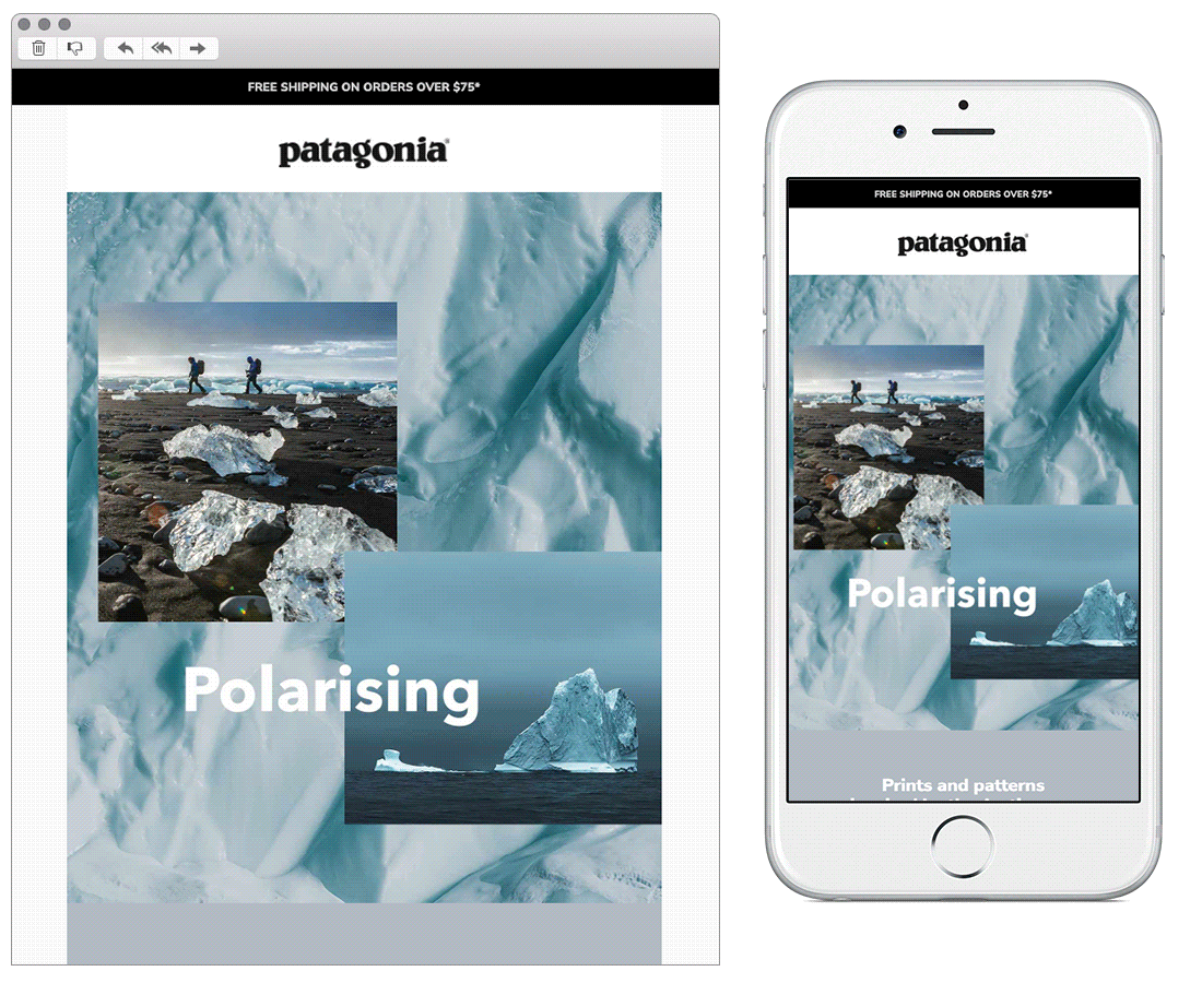
Chosen for:
Content. Patagonia make great use of the inverted pyramid layout within all of their designs. They often include a lot of content creating quite lengthy emails, so making this easy for the reader to follow is really important.
We love the balance of product shots, brand ambassadors, outdoor inspiration and relatable themed content, this really helps to convey their messaging and what they stand for.
5. French Connection
SL: This just in: Extra 20% off sale

Chosen for:
Design. A purely typographic email is not something we see very often, so this stood out to us with its bold use of colour and subtle animation. This is a great way to design to ensure the main message is not lost amongst other content. We also enjoyed the interactive ‘shop by your size’ element, making the journey as easy and seamless as possible for the customer.
6. Glossier
SL: It just takes 3 steps

Chosen for:
Layout. A ‘Z-pattern’ design is a great layout to choose when you’re wanting to guide your reader in a specific way. Working really well for this Glossier email, where the content is broken up into three sections with individual calls to action for each. The separate bold call to action at the bottom also wraps the email up nicely, incase the customer is requiring the general website rather than a specific product.
7. NOTHS
SL: Eep, don’t miss out on 15% off*, Holly
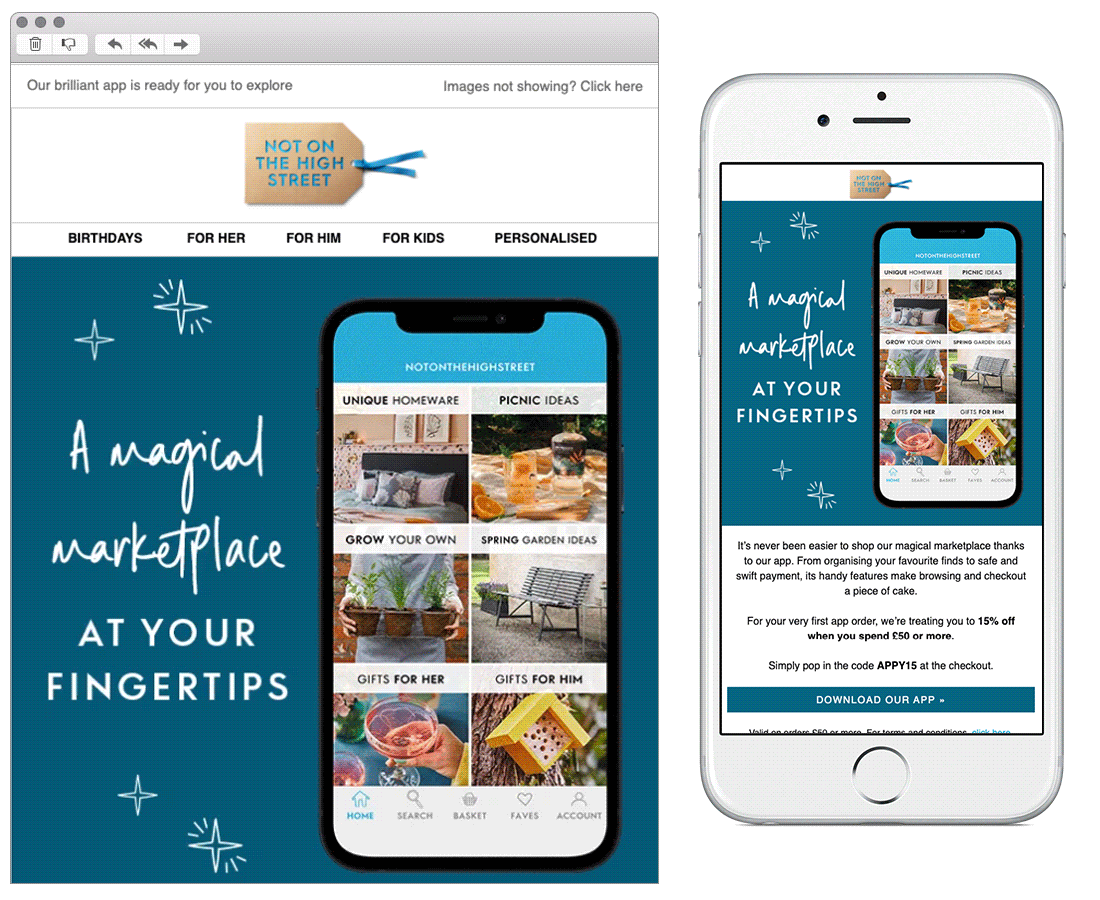
Chosen for:
Push to app. If you’re wanting customers to download your app, email is a great channel to make use of. An established relationship will give you a head start when wanting them to take an action like this. This example shows the different ways of demonstrating benefits of the app to the customer in fun, clear, and bitesize ways including a fail-proof exclusive offer.
8. H&M
SL: What a style you've got!

Chosen for:
Personalisation. This email has been heavily personalised based on products that have been favourited within the users H&M account. A clever way of reminding them about items they liked, and including them within the design in a way which still looks seamless and works for an automated email.

Bex Highfield
Marketing strategist
